Role
Founding Designer
Year
2020-2021
Duration
12 months

Context
Before Plask, getting usable MoCap data required thousands of dollars for a professional studio and a full-body suit. Plask eliminated all of that: upload a video, get professional-grade motion data. It was a web-based, AI-powered motion capture editor, and it was genuinely new technology. The company was pre-seed.
Problem
They hadn't proven who needed it badly enough to build a product around, or whether those people could actually succeed with it on their own. Without that proof, there was no fundable story.
What I Did
I joined as its founding designer; the product had no design system, no onboarding, and no established users. I built from zero: a guided onboarding flow and a simplified motion editor. Every decision served one goal: a developer handling their own animation should be able to go from opening Plask to exported motion data without asking a single question.
Impact
Within four days of launch, Plask attracted 20,000 users through word of mouth alone. Plask raised $2.56M in 2021, months after my work. In 2022, Plask raised $8.6M.
Plask's technology was genuinely new: machine learning that converted a regular video into usable 3D motion capture data. No suit, no studio, no specialized hardware. But the business problem wasn't the technology. It was finding who actually needed it and making the product legible to them fast enough to matter.
When I joined, the initial target was broad: anyone curious about animation, casual creators, beginners with no industry background. The product was free, the audience was undefined, and there was no design foundation to build on. No sales team, no onboarding specialists, no support infrastructure.
What was at stake
At pre-seed with no revenue and no established user base, every interaction with the product was also an audition. If a cold user opened the editor and couldn't figure out what to do, there was no one to help them and no follow-up to bring them back.
The design had to do the work that a sales team, an onboarding specialist, and a support rep would normally do, all at once, from the first screen. The 20,000 users who found Plask in its first four days arrived because someone told them to try it. Whether they stayed depended entirely on what they found when they got there.
Before any wireframes, I needed to answer a more fundamental question: who was this actually for?
I spoke with developers in my network across software engineering and game dev. The initial brief pointed at a broad audience, but the research pointed somewhere more specific. We had a hypothesis that game devs were the right bet, and the conversations confirmed it. I made the call to focus the product experience around them.
Game developers had a concrete, urgent need: character movement data for a game they were trying to ship.
They didn't need to have mastery over a new tool. They needed to get in, get their data, and get out. Figuring this out let me to define who the user is at pre-seed.
What the research also revealed was the exact moment where things broke down. When a developer opened the editor for the first time, they froze. Every control was visible at once, with no indication of what to do first or what order things happened in.
To understand whether the problem was the tool or the domain, I worked through Blender and existing 3D animation workflows myself. The learning curve wasn't about skill. It was about not knowing where anything was.
That told me where to concentrate the team's energy: not the editor itself, but the entry point. Getting someone through the first two minutes without confusion was the highest-leverage problem to solve. Everything else could follow.
I mapped the ideal creator journey with the founding team and the developers I interviewed, then sequenced the experience so that nothing appeared before the user was ready for it.


The goal: a developer with no animation background should be able to go from opening Plask to exported motion data without asking a single question.
Showed users exactly what came next, at every stage: Rather than opening into the full editor, I designed a guided entry flow that introduced each step in sequence. From uploading videos, reviewing outputs, editing, and exporting, I covered it all.
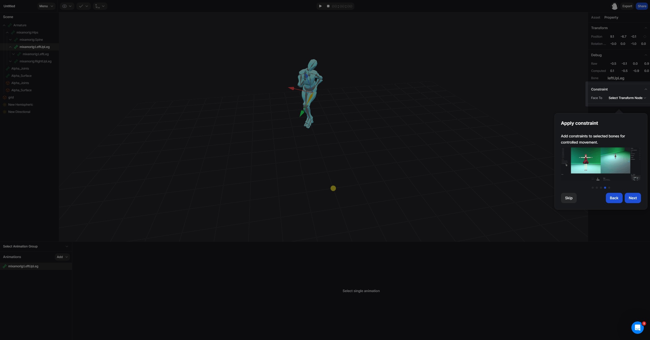
Reframed editing so it felt like adjusting, not fixing: Cleanup is the hardest moment in mocap. Rather than designing controls that looked like professional animation software, I built interactions around simple controls, immediate visual feedback, and default settings that worked well out of the box. Advanced controls were available but never in the way.
Made it impossible to edit the wrong thing by accident: Developers often mixed up motion editing and timeline editing, which caused a number of issues. I made it obvious where users were so they never touched the wrong thing by accident.
Within four days of its first public unveiling, Plask attracted 20,000 users through word of mouth alone. No paid acquisition, no sales outreach.
In October 2021, Plask raised $2.56M in seed funding. In 2022, they raised $8.6M.
